MCU officially unveils huge change to The Avengers as we know them

Topics: MCU, Marvel, TV And Film, Disney, Avengers
Topics: MCU, Marvel, TV And Film, Disney, Avengers
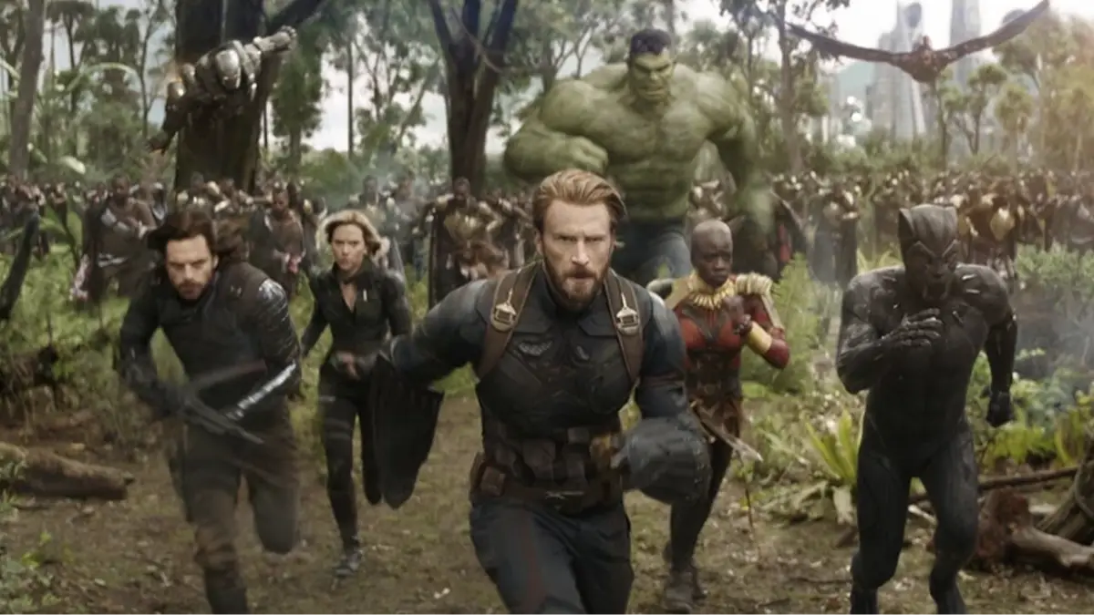
Marvel Studios is making some big leaps over the next couple of years, starting with Avengers: DOOMSDAY, and bringing the audience another huge crossover cinema event.
It could mark the start of a new era for the MCU, as the fallout from the events of the next two Avengers films will have huge ramifications for both heroes and villains.
Marvel's latest team is heading to cinemas today in Thunderbolts*
Advert
With this in mind, Marvel has decided to rebrand the Avengers franchise with a new logo, moving on from the iconic ‘A’ with the right-pointing arrow cutting the through letter.
It’s an icon that has accompanied every Avengers outing, so far, but with things changing, Marvel has revamped the logo, and in my opinion, it’s for the worse.
And I’m not the only one, as seen in the Twitter replies beneath the reveal.
Now, the logo feels like it's trying to be edgy, with a scratched silver effect, a spike emerging from the left-hand side of the ‘A’ and a more scrunched feel.
“NOOOOOO... I don't like this rebrand,” said one Marvel fan.
I appreciate that things sometimes need a refresh, but this feels like a downgrade, with too much change, rather than a subtle tweaking as we would see with Batman’s logo, or Superman’s iconic ‘S.’
“No, why would they downgrade it like that,” said another Twitter user.
“Why are we changing unnecessary things?” comments another.
Hopefully, it’s a temporary change, and done only for the entrance of Doctor Doom, perhaps hinting at his own version of The Avengers.
I dearly hope so, because this thing is ugly and needs to be put back where it came from, quickly.
Will we see this new ‘A’ adorning the Avengers: DOOMSDAY poster? Or is it a symbol for an ‘evil Avengers’ led by Doom? There's also the possibility that this is linked to Thunderbolts* given the timing of its arrival but I'm sure, like me, you're trying to avoid spoilers.
So many questions, and hopefully all will be revealed by Marvel soon. Hey, maybe we'll even get them at the cinema this weekend.